Blog
Characters with characteristics
Last time, I told you about the algorithmic aspect of travel: today explains how I handled the graphics part.
Displaying an animation
It's as old as the first phenakistiscope: to simulate an animated movement, we chain a certain number of images at a certain frequency. Until recently, the cinema displayed 24 FPS (Frames Per Second). A lot of modern movies and video games are more likely to use 60 FPS.
In my case, I'm drawing an “old-fashioned” cartoon (each drawing is done one by one without any automatic interpolation technique), I chose 12 FPS, which corresponds roughly to what was used in classic animation (such as Merrie Melodies, Bugs Bunny et al). In practice, the animation would appear far too choppy for a movie (or for 3D models), but for a handmade drawing, it works just fine:
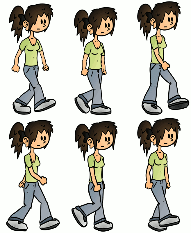
Of course, the graphics engine itself is clocked at 60 FPS in order to be responsive (cursor movements, buttons, etc.). Only the “cartoon” part clocks at 12 FPS: in practice, this means that we only go from one image of the animation to another once every 5 refreshes of the screen.
Eight steps
For now, I have only drawn / programmed the main character who will be controlled by the player: Sophie (later, Superfluous himself will become playable, we will probably be able to switch from one to the other). And what this character will mainly do is walk.
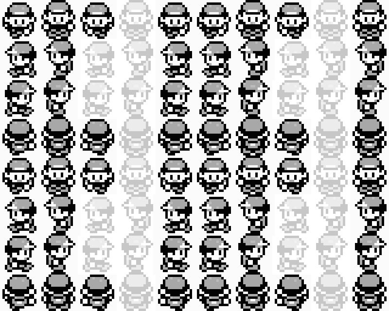
Animating a walk is a very classic problem in video games. Many old video games used a cycle of 4 images (often 3 with one of the images used twice), or even 2 images by taking advantage of the confusion between the right and left legs. This is what is done in the first generation of Pokémon games:
A game like Prince of Persia – aiming at being more realistic – will use up to 8 images:
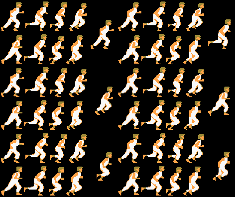
There is really no limit, we could go up to 60 frames to match the refresh of the game. Of course, the higher the number of frames, the more fluid the animation will be (of course, it is then necessary to adapt the number of FPS so that the walk is neither too fast nor too slow).
In my case, after several tries, I decided to stick to 8 images per cycle: memory is not really a limiting criterion as it would have been for Game Boy or NES games, and even if it takes a while to draw it all, it's still the most viewed animation in the game, so it's worth the effort.
Pendulum swing
From there, I need to draw a “realistic” animation, or at least “believable”: as it is a cartoon, it's OK to exaggerate some movements without it being shocking (on the contrary, it can make it more cartoonish).
I'm not going to redo a tutorial on the explanation of a human walk, the pendulum and all. Before I started, I did read a lot of tutorials on the subject, there are a many on the Internet, here are a few:
- Animation: Walk cycle and Run cycle (Construct.net)
- ALAN BECKER -- Animating Walk Cycles (YouTube)
- How To Pixel Art Tutorials 17 -- Walk Cycle (6 & 8 frames) (YouTube)
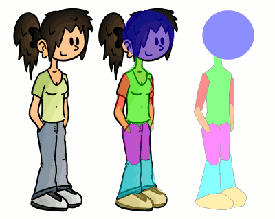
First, in order to be able to focus on the movement alone and ignore the drawing at first, I broke down a typical Sophie drawing into different parts of the body to animate:
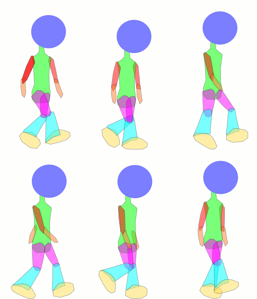
Then I moved these different elements one by one to create the different positions by following the tutorials given above:

I was then able to visualize the animation and adjust it until I had a result that looked good to me:
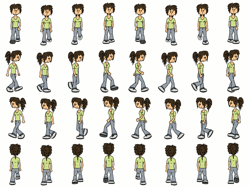
Then, I simply redraw Sophie by following the contours of the silhouette in these different positions (by copying and pasting some parts that did not change):

And there you go! Notice a little subtlety: I also added a little rocking movement to the ponytail (which was of course not expected on the animated figure), which makes the whole thing a bit more dynamic and realistic. In practice, I must say that it's hardly noticeable when Sophie moves around in the game scene, but hey ... I'm still glad I did it 😀

Then, I just had to repeat the same process to go to the left (there, I did a lot of copy and paste since it is almost symmetrical), from top to bottom and from bottom to top. I hardly ever draw my characters from the front, so it was a bit complicated to make these last two variations, but in the end, it looks pretty good:
For the animation of Superfluous, I'll probably reuse the silhouette animation, adapting it to the character's proportions (which aren't fundamentally far from Sophie's, actually).
Idle... but not too much
When Sophie isn't walking, I figured it would still be nice to make her move a little: in reality, even when we are standing, we are rarely perfectly still, and I found it would be quite bad to see a still image the entire time the character is not in motion. So I decided to animate several things:
- the position of the body, allowing Sophie to cross her arms, put her hands on her hips, etc.;
- the expression of the face, which is reflected by the way the eyes are drawn in my case;
- the mouth, which only moves when Sophie speaks.
In practice, the image of the idle Sophie is broken down into three: the body, the face and the mouth. Note that for the idle positions, I took the liberty of not doing a front (or back) version, since once again I prefer to draw my characters turned three-quarters. After walking from the front or from the back, Sophie will just systematically reposition herself to the side.
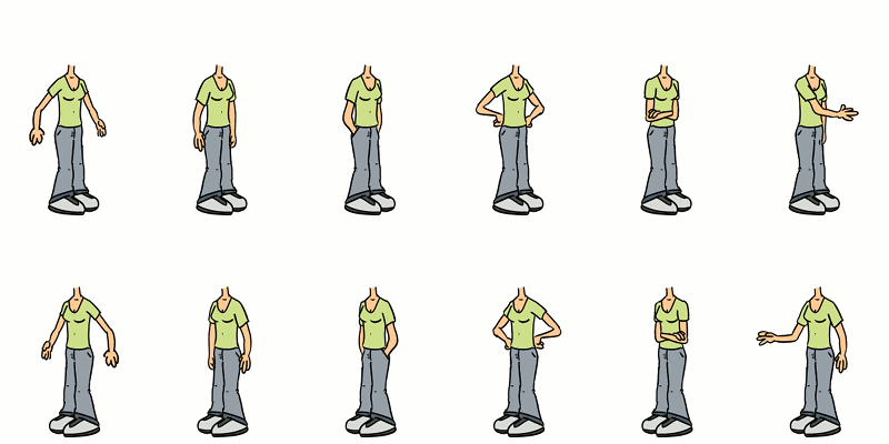
For the body, Sophie stays in the same position between 2 and 12 seconds, then a random position is drawn. The first image serves as a transition (displayed for 2 animation frames) when changing position. So, rather than keeping her arms dangling, Sophie will change her position from time to time, as if to ask the person behind the screen: “hey! What should I do now?”
The last image is not used for the idle version but serves as an “action” image, whenever Sophie picks up an object for example.

For the face, technically, I could have used the same image for the outline and have a variant image for the eyes, but that could allow, for other characters, to change something other than the eyes for the changes of expression. Again, it's the same principle as for the body, the expression is drawn randomly, with the same timings, but based on another random draw (the body and the face will not necessarily change at the same time).
The second image is a blink of the eye: yet another random draw! Sophie will keep her eyes open for between 0.4 and 4 seconds, then blink: the blink is very brief and therefore only takes one frame.

For the mouth, when Sophie is idle, the first image is used. When she speaks, I simply draw images randomly from the list (while making sure I don't pick the same twice in a row, to avoid “pause” effects in the animation). It's not the most realistic, but it looks pretty good.
A character with characteristics!
Yes, that title was a silly pun. In the end, we have:
- 8×4 = 32 images for the walk
- 6×2 = 12 images for the idle body
- 7×2 = 14 images for the face
- 11×2 = 22 images for the mouth
And these 80 images in total are enough to make Sophie a character alive enough for this small artisanal video game! Of course, additional images will probably be added later for specific animations (I already need to have an image of her talking on a cell phone), but it's a good start.
I'm not sure what the next making-of will be about: maybe how to write levels and game content and store them? Or maybe the sound part, hey, that can be interesting too ...
